This post is the continuation of the adding custom cells for tableview, in this post we will see how to configure and setup the header and footer views for a tableview in iOS, these header and footer view generally specifies the area of section’s top and bottom, where you can add some more info for the list of items that you are showing in the tableview not only that you can add interactive elements like for example, adding a button to perform some actions.
If you want to skip to adding footer view you can find the details here, if not lets proceed.
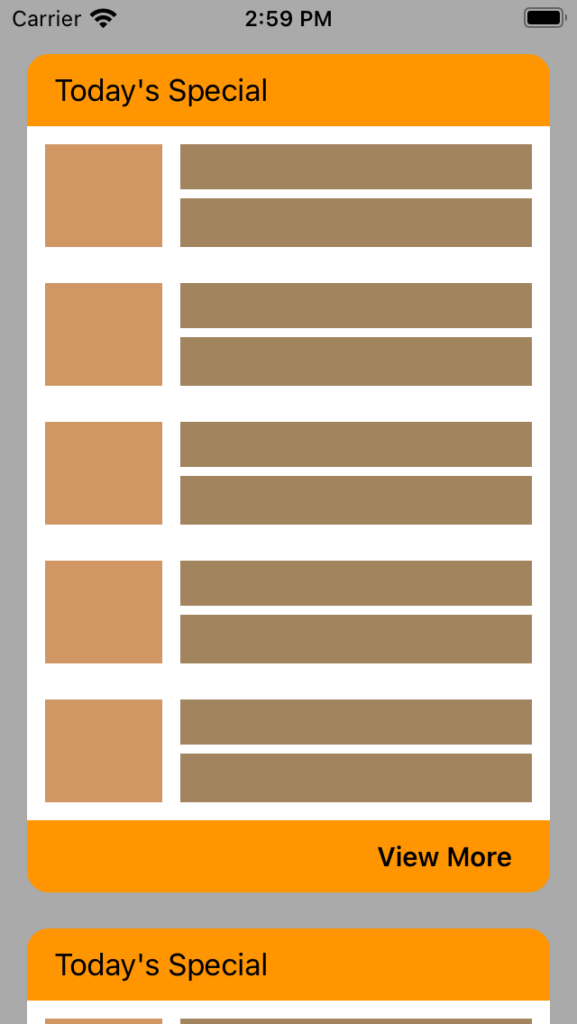
Now in the same project that we have created in adding custom cells for tableview we will continue in that project, since we already learned how to customise the table view cells now lets learn about how to setup and configure custom header and footer views for the tableview. We will achieve the output like below image. Each header with title and footer with “View More” button.
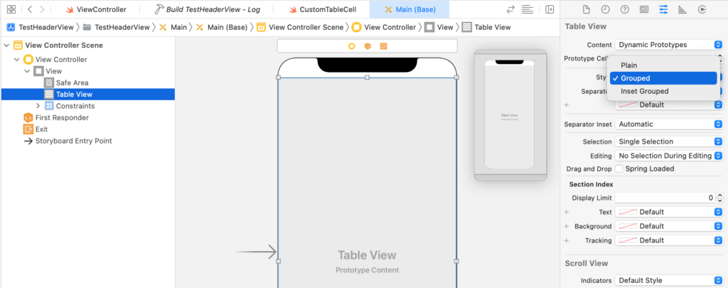
Now open Main.storyboard and select tableview and change style to Grouped
Now add new swift file CustomHeaderView and add below code.
//1.Creating a new class which is sub class of UITableViewHeaderFooterView
class CustomHeaderView: UITableViewHeaderFooterView {

    //2.Defined outlets for border view and title label
    @IBOutlet weak var borderView: UIView!
    @IBOutlet weak var headerTitleLabel: UILabel!

    override func awakeFromNib() {
        super.awakeFromNib()
    }
}

//3.Reusable protocol for views
extension CustomHeaderView: Reuseable {
    static func reuseID() -> String {
        return String(describing: self)
    }
}
In the above code,
- Created a class called CustomHeaderView which is a sub class of UITableViewHeaderFooterView
- As per our design we have some holder view and a header title
- Confirmed to protocol Reuseable protocol to get the reuse ID
Now let’s add new xib file name it as CustomHeaderView.xib open this file and add a empty view set its size to freeform as shown in below image.
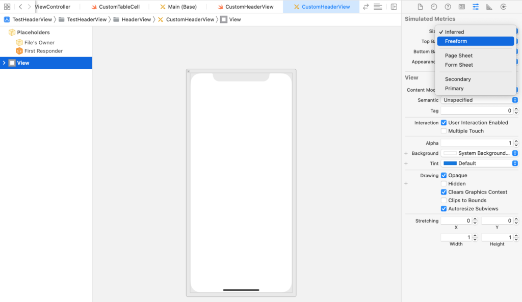
Once after setting the size to Freeform, we can able to resize the view, drag the view and set to some height and set its class to CustomHeaderView as shown in below image.
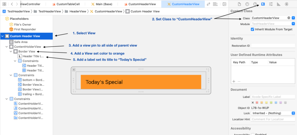
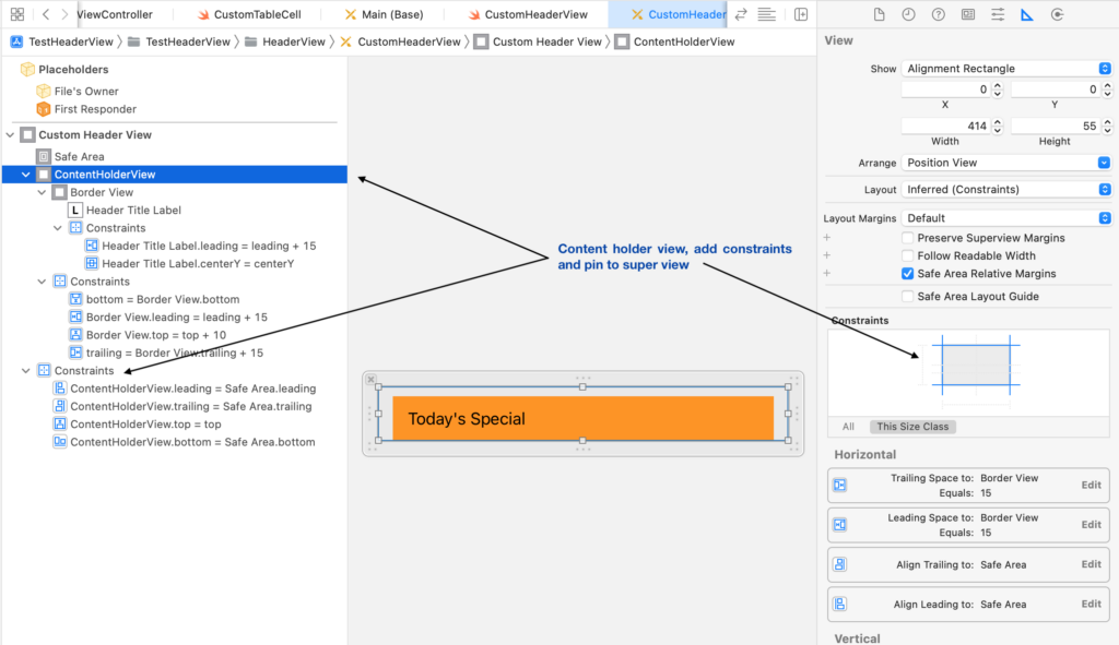
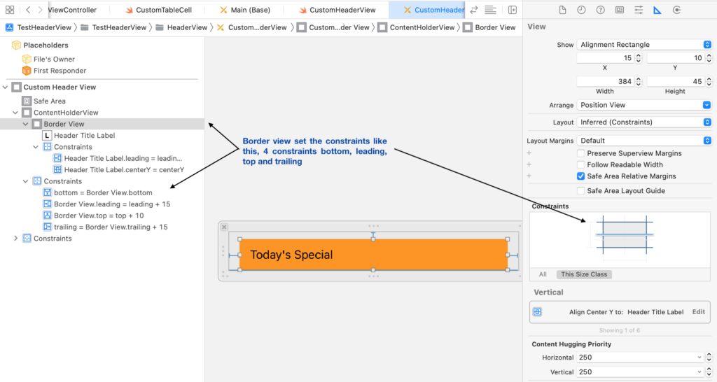
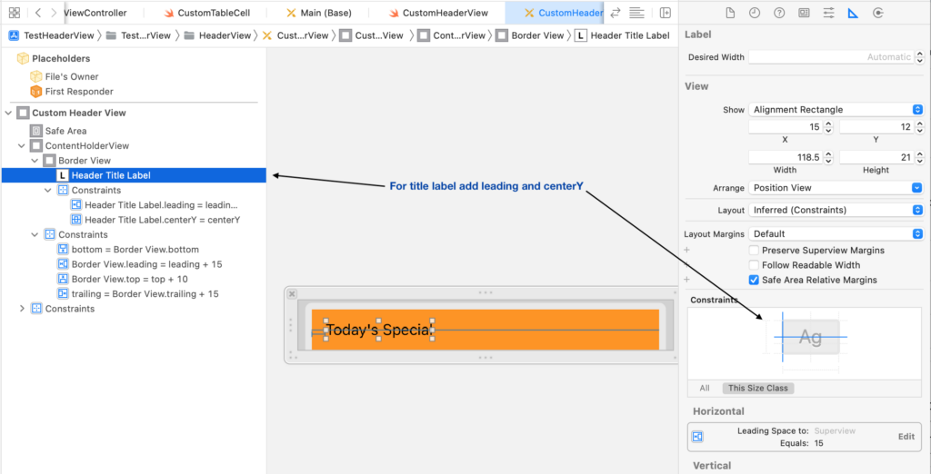
For the orange colour view you can pin the view to give some gap for top, left and right side of the border view, for the label also set the center Y axis and give leading space as shown in below images.
For Content holder view setup constraints like below,
For border view setup constraints like below,
For title label setup constraints like below,
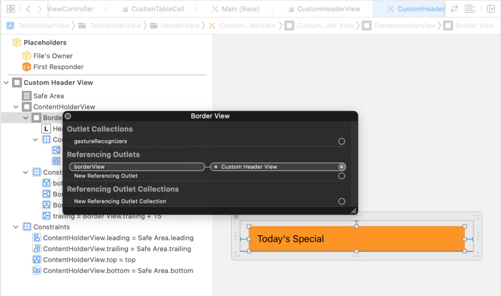
Now with the above setup our header view is ready with label, now connect the outlets defined in the CustomHeaderView class, with these outlets connected from xib to CustomHeaderView class, we can access them and modify properties dynamically.
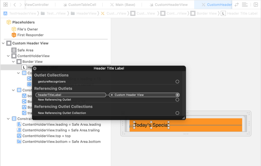
Now let’s add some code to load this header view to table view that is present in ViewController class. Open ViewController.swift file and make the changes like below.
import UIKit

class ViewController: UIViewController {
    //1
    @IBOutlet weak var tableView: UITableView!

    override func viewDidLoad() {
        super.viewDidLoad()
        registerViewsToTableView()
    }

    private func registerViewsToTableView() {
        tableView.register(UINib(nibName: "CustomTableCell", bundle: nil), forCellReuseIdentifier:CustomTableCell.reuseID())

        //Register header view for the table
        tableView.register(UINib(nibName: "CustomHeaderView", bundle: nil), forHeaderFooterViewReuseIdentifier: CustomHeaderView.reuseID())
    }
}

    //2
extension ViewController: UITableViewDataSource, UITableViewDelegate {
    func numberOfSections(in tableView: UITableView) -> Int {
        return 5
    }

    func tableView(_ tableView: UITableView, numberOfRowsInSection section: Int) -> Int {
        return Int.random(in: 3...5)
    }

    func tableView(_ tableView: UITableView, cellForRowAt indexPath: IndexPath) -> UITableViewCell {
        let cell = tableView.dequeueReusableCell(withIdentifier: CustomTableCell.reuseID())
        guard let customCell = cell as? CustomTableCell else { return UITableViewCell() }
        return customCell
    }

    //Return the header view in this delegate method
    func tableView(_ tableView: UITableView, viewForHeaderInSection section: Int) -> UIView? {
        guard let headerView = tableView.dequeueReusableHeaderFooterView(withIdentifier: CustomHeaderView.reuseID()) as? CustomHeaderView  else { return nil }
        return headerView
    }

    //Setting the height for header view
    func tableView(_ tableView: UITableView, heightForHeaderInSection section: Int) -> CGFloat {
        return 50.0
    }
}
In the above code we are simply registering the header view to table view using the method, register(_ nib: UINib?, forHeaderFooterViewReuseIdentifier identifier: String) of the table view, it takes the nib file since we have created a dedicated xib file for table view we can easily create an nib instance with the name of the file CustomHeaderView and the reuse id.
After that we are adding new delegate methods of table view, tableView(_ tableView: UITableView, viewForHeaderInSection section: Int) -> UIView? this method simply asks for the view, in our case we will simply return the instance of the CustomHeaderView, as we already know how table view cells works well by dequeueReusableCell method, same applicable here also, tableView.dequeueReusableHeaderFooterView(withIdentifier: CustomHeaderView.reuseID()) this method simply creates a new instance of the view based on the reuse ID. make sure to register the view before calling this method.
After that we are adding one more delegate method tableView(_ tableView: UITableView, heightForHeaderInSection section: Int) -> CGFloat this method we are returning some height for for our header view.
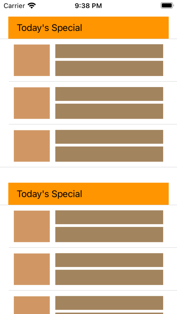
Now with the above code in place run the app you will able to see the table view header as shown in below image.
Now that our custom header view is displayed, lets make the header view to rounded top left and top right side, lets open CustomHeaderView.swift file and make the changes like below.
//1.Creating a new class which is sub class of UITableViewHeaderFooterView
class CustomHeaderView: UITableViewHeaderFooterView {

    //2.Defined outlets for border view and title label
    @IBOutlet weak var borderView: UIView!
    @IBOutlet weak var headerTitleLabel: UILabel!

    override func awakeFromNib() {
        super.awakeFromNib()

        //1
        self.maskTopOnlyRoundedCorner(for: self.borderView)
    }

     //2 method we have added to make the border to rounded corner
    func maskTopOnlyRoundedCorner(for view: UIView) {
        view.layer.cornerRadius = 12.0
        view.layer.maskedCorners = [.layerMaxXMinYCorner, .layerMinXMinYCorner]
    }
}

//3.Reusable protocol for views
extension CustomHeaderView: Reuseable {
    static func reuseID() -> String {
        return String(describing: self)
    }
}
Make sure the outlets are connect to borderView, we have added new method maskTopOnlyRoundedCorner(for view: UIView) this method takes the view as an input and in side this method we are simply setting the view’s cornerRadius and maskedCorners.
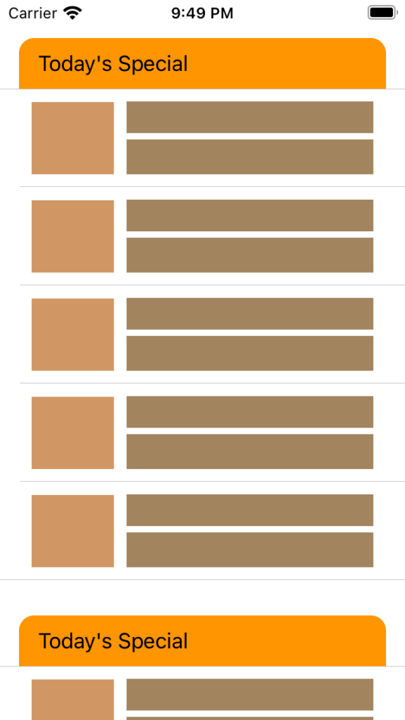
Now lets run once again with the above changes you will see the table view with custom header view with nice rounded corner as shown below.
Nice, now we at this point we have learned how to display custom header view in the next post we will learn about setting up the custom footer view, it is almost same as configuring the the header view, not only that in next post we will see how to handle user interactions from footer view.
You can download sample project from this link.